Cart
0
How a Yellow Rug Transforms a Space
A rug changes a room from the ground up.
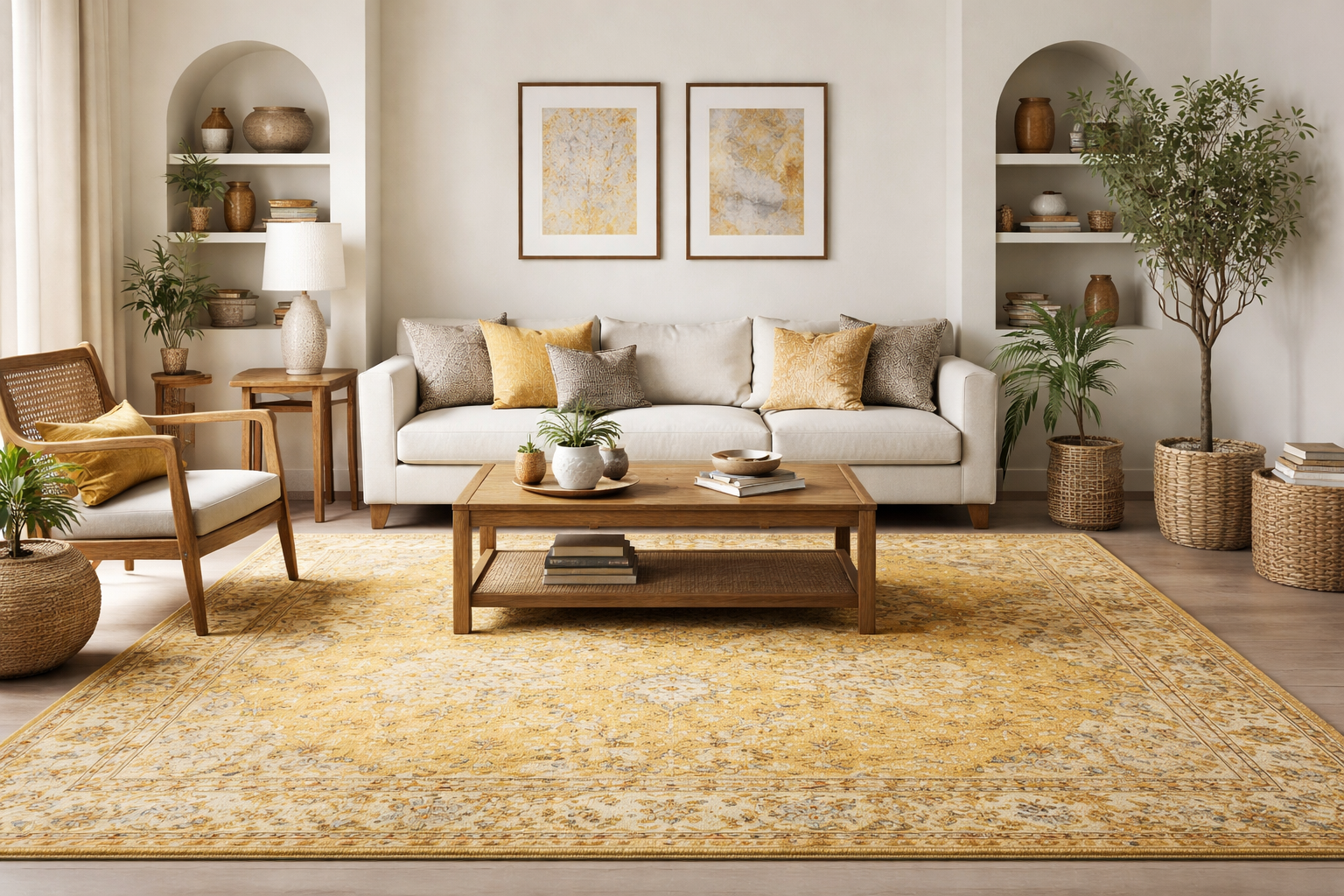
And when that rug carries a warm yellow tone, the impact is immediate. The space feels brighter. Warmer. More alive. In many modern living room rugs yellow is often used to bring energy into otherwise neutral spaces without overwhelming the design.
But the real success of styling lies not in choosing yellow, it lies in knowing how to support it.

In Indian homes especially, flooring, wood tones, natural light, and wall paint all play an important role in how a rug behaves. Yellow can elevate the room beautifully. Or it can feel overpowering if paired carelessly.
Let’s approach this practically.
Start With the Shade, Not the Trend
Before you think about walls, think about the rug itself.
Mustard and ochre tones feel grounded and mature. They sit beautifully against darker woods like teak and walnut. These shades work well in living rooms that already have strong furniture pieces.
Softer butter or pastel yellows feel lighter. They suit smaller apartments and minimalist interiors where openness matters more than drama.
Golden tones add richness. When layered with brass décor and textured fabrics, they can create a slightly luxurious feel without being flashy.
The shade determines the mood. The walls should follow.
Wall Colors That Actually Support the Rug
Warm Whites and Creams
This is the safest and often the most elegant choice.
Cream walls allow the rug to stand out gently without visual tension. In homes with marble flooring or neutral sofas, this pairing feels balanced and open.
If your furniture is already warm-toned, white walls prevent the room from becoming too heavy.
Sometimes restraint creates the strongest design statement.
Grey for Modern Homes
Light grey walls paired with mustard tones create a refined, contemporary look. This works especially well in urban apartments with structured furniture and clean lines.
Charcoal walls can look dramatic but require strong daylight. In dim rooms, they may overpower the warmth.
Grey cools the palette slightly, which keeps yellow from feeling too intense.
Beige and Sand Tones
Beige creates harmony.
In homes with carved wooden furniture or woven accents, this pairing feels very natural. The room feels layered rather than contrasted.
Use the 60-30-10 principle here:
Wall as the base.
Furniture as the structure.
Rug as the accent.
This keeps the warmth controlled.
Deep Blue or Olive
For those who prefer contrast, navy walls paired with mustard tones create a bold yet sophisticated look. Olive green offers something softer and more organic.
These combinations work beautifully in living rooms where you want personality without clutter.
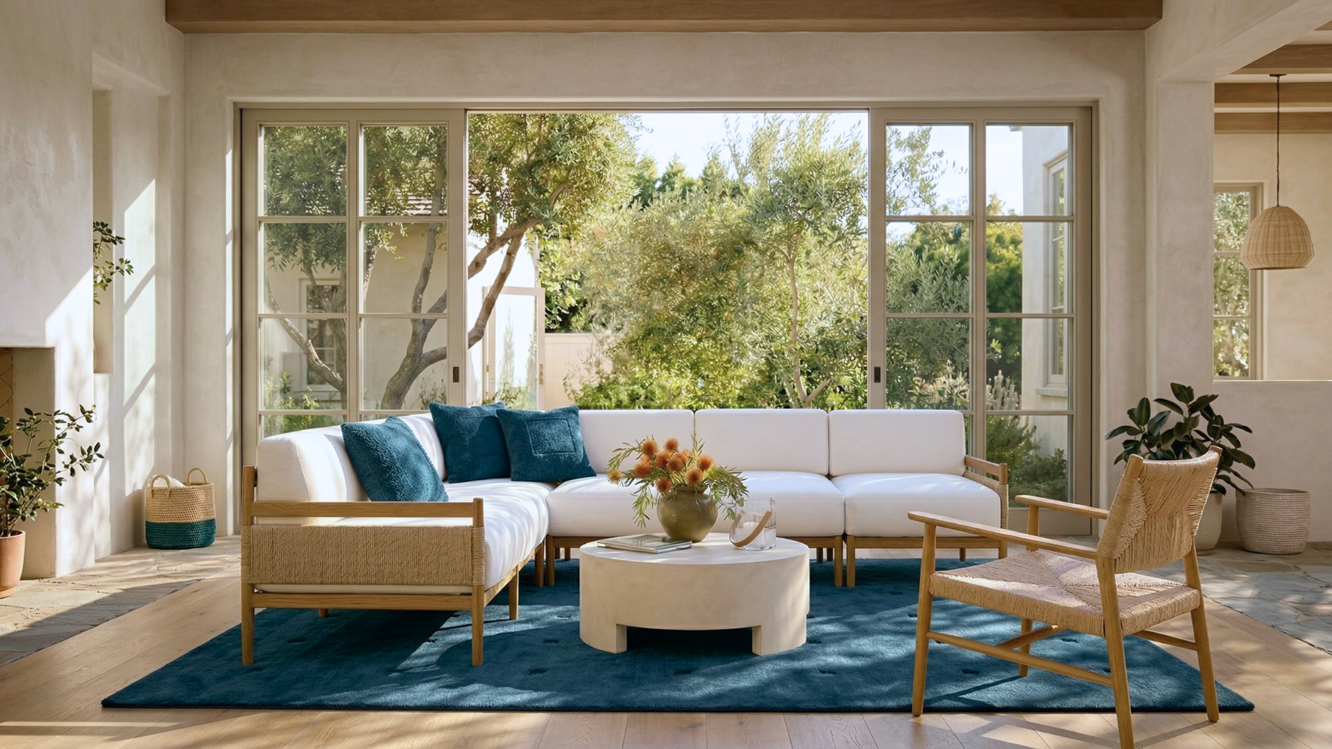
Placement Matters as Much as Color
In Indian living rooms, rugs are often either too small or too disconnected from furniture.
A properly sized piece should anchor the seating area. Front legs of sofas and chairs should sit comfortably on it. This creates cohesion.
In bedrooms, place it under the lower two-thirds of the bed. This allows the color to frame the sleeping area without overwhelming the space.
In dining areas, ensure it extends at least 24 inches beyond the table edges so chairs remain on it even when pulled out.
Scale determines elegance.
Material and Texture Considerations
Texture affects how the color appears.
A hand tufted wool surface absorbs light softly, making mustard tones feel deeper and richer. A flatwoven construction may appear brighter and slightly sharper.
In Indian climates, wool performs well because it resists dust settling deeply and maintains structure over time. Low to medium pile heights are easier to maintain in high-traffic homes.
Texture should match the lifestyle of the space.
Lighting Changes Everything
Morning light softens yellow. Afternoon sunlight intensifies it. Warm artificial lighting enhances golden undertones. Cool white bulbs can make it appear slightly dull.
Before finalizing wall paint, observe the rug in both natural and artificial light.
Design is not static. It shifts through the day.
Mistakes to Avoid
Avoid matching cushions exactly to the rug tone. That looks forced.
Avoid pairing bright yellow with bright walls. The room will feel restless.
Avoid ignoring undertones. Warm with warm, cool with cool.
And most importantly avoid oversizing or undersizing the rug.
Proportion is as important as color.
If you are exploring tones and placement ideas, browsing the collection of yellow rugs in real interior settings can help visualize how different shades behave with walls, flooring, and furniture.
When styled thoughtfully, yellow rugs do more than brighten a room. They anchor it. They connect wood, walls, and furniture into a cohesive story. In Indian homes where warmth and texture already play such a strong role, the right pairing transforms a room quietly but completely.
Styling Balance That Feels Intentional
A yellow rug works best when the surrounding elements allow it to stand out without competition. Instead of repeating the same color across cushions, curtains, and décor, it is more effective to introduce contrast through restraint. Neutral upholstery, soft fabrics like linen, and controlled use of darker accents help the rug remain the focal point while keeping the overall space composed.
This approach also improves longevity. When too many elements try to match the rug, the room can feel overly styled and quickly dated. By allowing the rug to lead and keeping the rest of the palette supportive, the space feels more natural and easier to live in over time. The goal is not coordination, but balance that feels effortless.
FAQs
1. Are yellow rugs suitable for Indian living rooms with heavy wooden furniture?
From experience, yes but only if the shade is chosen carefully. In homes with dark teak or walnut furniture, muted mustard or ochre tones work far better than bright lemon shades. They complement the warmth of the wood instead of competing with it. Lighter yellows can sometimes look disconnected against heavy furniture, so grounding tones usually perform better in traditional Indian living rooms.
2. Do yellow rugs make a room look bigger or smaller?
It depends on the tone and placement. In smaller apartments, lighter butter or pastel shades can actually make the space feel more open because they reflect light. However, darker mustard tones visually anchor the room, which works better in medium to large spaces. Proper sizing is more important than color a correctly sized rug always improves spatial perception.
3. What wall colors should I avoid with yellow rugs?
Avoid pairing very bright yellow tones with equally bright wall colors like neon greens or overly saturated reds. These combinations create visual tension. Also be cautious with cool grey walls if the rug has strong warm undertones mismatched undertones often make the room feel slightly uncomfortable without you knowing why.
4. Are yellow rugs hard to maintain in Indian homes?
In practical use, they are no more difficult than other mid-tone colors. Extremely light cream tones show dust faster, while deeper mustard shades actually hide daily wear better. Regular vacuuming and occasional professional cleaning are enough. Wool constructions tend to perform well in Indian conditions because they resist flattening and maintain texture over time.
5. Can yellow rugs work in minimalist interiors?
Yes, and often beautifully. In minimalist homes dominated by whites and greys, a muted yellow rug can become the single warm focal point that prevents the space from feeling cold. The key is restraint keep other accents neutral and allow the rug to introduce warmth naturally.
6. How do I know if my yellow rug will clash with my wall paint?
The safest method is to compare undertones in natural daylight. Place a small sample or corner of the rug against the wall during morning and evening light. If the colors feel harmonious without strain, they will likely work long term. If something feels slightly off, it usually means undertones are clashing.
7. Should I match cushions and curtains with my yellow rug?
Exact matching often looks artificial. Instead, repeat the warmth subtly. For example, introduce one cushion with a hint of similar tone, or artwork that carries complementary shades. Layering is more refined than direct matching.