Cart
0
Choosing the right living room rugs is where most people start feeling confused, especially when it comes to color. There are too many options available, and what looks perfect online does not always feel the same once it is placed inside a real home. A rug might look soft and balanced in a product image, but under your lighting, next to your sofa, and within your room’s layout, it can behave completely differently.
This is where many people struggle while exploring different living room rugs because the confusion is not about design, but about how the color will actually work in their space. The same rug can feel calm in one setup and slightly off in another, depending on the surrounding elements. This is why color becomes such an important decision. It is not just about what looks good, but about what actually works with your space. The right rug color can make your living room feel open and comfortable, while the wrong one can make it feel slightly heavy or disconnected without you even realizing why.
If you are planning to add something like an 8x10 rug or any standard size, it is important to think beyond just design or pattern. The color should connect with your sofa, blend with your walls, and adjust naturally with your lighting throughout the day. These small details are what make a rug feel right in real use, not just in pictures.

Why Rug Color Matters in a Living Room
Color does more than decorate a floor. It changes perception.
In smaller rooms, the wrong rug color can make the entire layout feel tight or visually crowded. In larger spaces, a poorly chosen tone can leave the room feeling disconnected, where furniture looks like it is floating instead of forming a cohesive layout.
There is also a psychological layer involved. Softer tones tend to relax the eye, which is why neutral rugs are often used in spaces meant for unwinding. On the other hand, deeper tones introduce visual weight, which can make a seating area feel more grounded and intentional.
A common question people ask is what color rug is best for a living room. The answer is not a single shade, it depends on what your space already has and what it lacks. The rug should fill that gap, not compete with it.
Best Neutral Rug Colors for Living Rooms
Neutral rugs are often seen as the safe option, but in reality, they are the most strategic choice when used correctly. They allow flexibility, which is important because living rooms tend to evolve over time with new furniture, décor, or layout changes.
Beige and ivory tones are particularly effective in homes where multiple materials are already present. Wood finishes, fabric upholstery, and mixed lighting conditions can sometimes create subtle visual noise. A beige rug helps calm that down by acting as a base layer that ties everything together without drawing attention to itself.
From a practical perspective, lighter neutrals also help in making compact living rooms feel more open. This is especially useful in apartments or spaces where natural light is limited.
Grey rugs bring a different kind of balance. They introduce a slightly cooler undertone, which works well in modern interiors where sharp lines and minimal palettes are used. Light grey can soften a space, while darker grey adds structure without becoming too dominant.
From experience, neutral rugs work best when you want the room to feel effortless. They do not demand attention, but they quietly improve everything around them.
Bold Rug Colors That Add Character
While neutral rugs create stability, bold colors introduce personality. The key is using them with control rather than letting them take over the room.

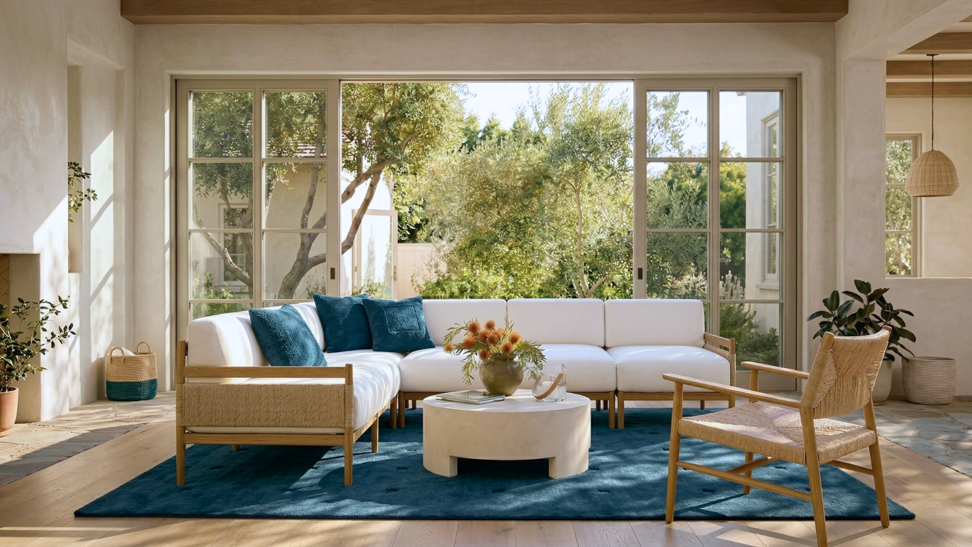
Blue rugs are one of the most reliable choices when adding color. A deeper blue can anchor a seating area, especially in larger rooms where lighter rugs may feel lost. At the same time, softer blue tones can create a calm, almost relaxed atmosphere without making the space feel dull.
Green rugs work differently. They bring a sense of freshness, especially when paired with natural textures like wood or soft fabrics. Shades like olive or sage tend to blend easily into interiors that already use earthy tones, making them feel intentional rather than decorative.
One important thing to keep in mind is balance. If the rug carries a strong color, other elements in the room should support it, not compete with it. Too many bold elements in one space can make the room feel visually heavy.
How to Choose Rug Color Based on Your Sofa
This is where most real decisions happen.
Your sofa is usually the largest object in the living room, so the rug color needs to either complement it or create a controlled contrast. Ignoring this relationship is one of the most common mistakes.
For grey sofas, lighter rugs like beige or soft neutrals help warm up the space. Without this contrast, the room can start to feel too cold or flat. If you want a bit more depth, muted blue tones can also work well without overpowering the setup.
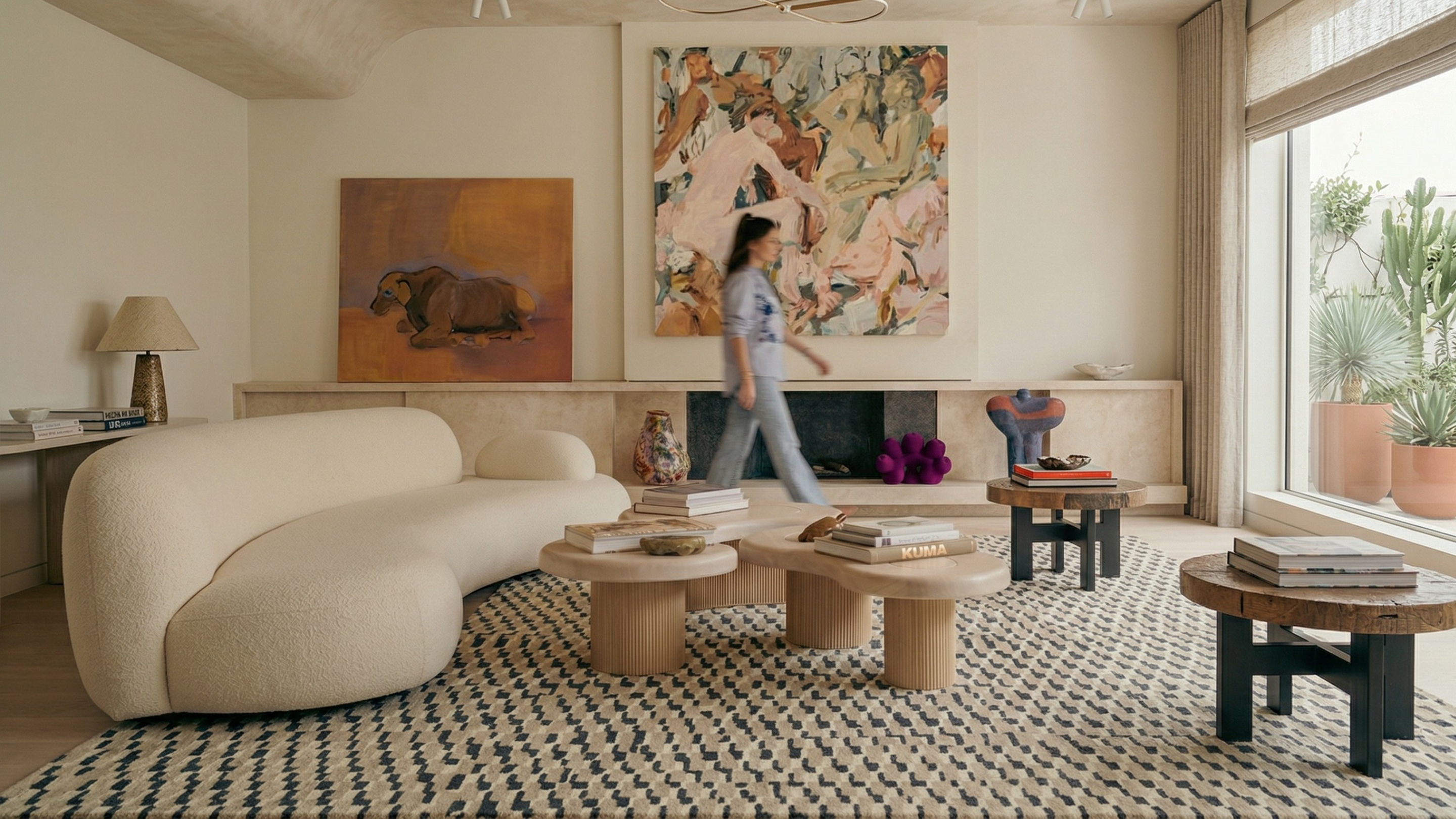
Beige or off-white sofas offer more flexibility. You can stay within similar tones for a seamless look, or introduce slightly darker rugs to define the seating area more clearly. This works particularly well in open layouts where you want to visually separate spaces.
With darker sofas, lighter rugs are almost always the better choice. They prevent the room from feeling too heavy and help highlight the furniture rather than letting it blend into the floor.
A question that often comes up is whether a rug should be lighter or darker than the sofa. In most cases, a slight contrast works better than exact matching. It creates depth without breaking harmony.
Rug Colors for Small vs Large Living Rooms
Room size changes how color behaves, even if the rug itself stays the same.
In smaller living rooms, lighter tones tend to perform better because they reflect more light and reduce visual weight. This makes the space feel more open and less crowded. Even subtle patterns in light shades can add interest without overwhelming the room.
Larger living rooms offer more flexibility. Darker rugs can be used to anchor the seating area, especially when there is a lot of empty floor space. They create a sense of structure, making the room feel more complete.
That said, layout matters as much as size. Open-plan spaces often benefit from rugs that clearly define zones, and color plays a key role in making that separation feel natural.
Matching Rug Colors with Walls and Curtains
A rug never exists in isolation. It sits within a broader color system that includes walls, curtains, and flooring.
White or neutral walls provide the most flexibility. In such spaces, the rug becomes the element that decides whether the room feels calm or dynamic. A neutral rug will keep things soft, while a colored rug will introduce contrast.
If your curtains already have patterns or strong colors, it is usually better to keep the rug more restrained. This avoids visual clutter and keeps the space balanced.
Wooden flooring adds another layer to consider. Warm-toned rugs blend naturally with it, while cooler tones create contrast. Neither approach is wrong, but the choice should depend on whether you want harmony or visual separation.
Modern vs Minimal vs Boho Rug Color Ideas
Different interior styles naturally guide color choices.
Modern living rooms often lean toward muted tones. Subtle contrasts, soft greys, and controlled patterns work well because they align with clean lines and structured layouts.
Minimal interiors rely on restraint. Neutral rugs dominate here, not because they are simple, but because they allow textures and proportions to stand out. Even a slight variation in tone can make a noticeable difference in such spaces.
Boho-style interiors take a more relaxed approach. Layered colors, earthy tones, and mixed patterns create a lived-in feel. The challenge here is not adding color, but balancing it so the room does not feel chaotic.

How to Match Rug Color with Furniture and Decor
Matching a rug with furniture is where most people get stuck, especially when multiple colors and textures are already present in the room. The goal is not to match everything exactly, but to create a visual connection so the space feels intentional rather than random.
If your furniture already has strong tones or patterns, it is usually better to choose a rug that feels calmer and more balanced. This helps avoid visual overload and allows each element to stand out without competing. On the other hand, if your furniture is mostly neutral, the rug can be used to introduce depth or subtle contrast.
A simple way to approach this is to pick one dominant color from your furniture or decor and let the rug either support it or gently contrast it. For example, if your space has warm wooden tones, rugs with beige or earthy undertones tend to blend naturally. If your decor leans toward cooler shades, soft greys or muted blues can create a smoother transition.
Many people also ask how to match rug color with furniture when the room already feels complete. In such cases, the rug should act as a connector, bringing together different elements rather than introducing something entirely new.

Common Mistakes to Avoid When Choosing Rug Colors
Choosing the right rug color is not just about what looks appealing at first glance. In most cases, mistakes happen when decisions are made without considering how the rug will behave inside a complete living room setup. A rug interacts with everything around it, including furniture, lighting, wall tones, and even the way the space is used daily. Ignoring this relationship is where most problems begin.
One of the most common mistakes is selecting a rug based only on how it looks in isolation. A color that feels balanced in a product image can look completely different once placed in a real environment. This happens because surrounding elements influence how the color is perceived. A beige rug, for example, may look soft and neutral online, but in a room with warm lighting and wooden furniture, it can appear much richer or slightly darker than expected.
Another issue is over-matching. Many people try to match the rug exactly with the sofa or walls, assuming it will create a cohesive look. In reality, this often makes the room feel flat and one-dimensional. Spaces that feel well-designed usually have a slight contrast between elements. This contrast creates depth and allows each piece to stand out without breaking harmony.
Lighting is another factor that is often overlooked. The same rug can look very different depending on whether the room receives natural daylight or relies on artificial lighting in the evening. Warm lighting can add a yellow tone, while cooler light can make colors appear slightly muted. This is why it is important to visualize the rug in your actual setting rather than relying entirely on how it appears on screen.
There is also a tendency to focus too much on color while ignoring texture. In many cases, texture plays an equally important role in how a rug is perceived. A subtle textured rug in a neutral shade can add more depth than a flat, bold-colored rug. When texture and color work together, the result feels more natural and balanced.
To make better decisions, it helps to be clear about what not to do:
- Do not choose a rug color without considering your sofa, walls, and overall palette together
- Avoid exact color matching between rug and furniture, it removes depth and makes the space feel flat
- Do not rely only on product images, real lighting conditions can change how the color appears
- Avoid very dark rugs in smaller rooms, especially if natural light is limited
- Do not introduce too many bold colors at once, it creates visual clutter
- Avoid ignoring texture, a well-textured neutral rug can often work better than a flat bold one
- Do not choose a rug just because it is trending, focus on what works in your space
A well-chosen rug color does not need to dominate the room. It should feel like a natural extension of the space, supporting the layout, complementing the furniture, and making the room feel complete without forcing attention.
FAQs
What color rug is best for a living room?
The best rug color depends on your existing setup. Neutral tones like beige, ivory, and grey work well in most living rooms because they blend easily with different furniture styles. If you want more depth or character, colors like blue or green can add contrast without overwhelming the space.
Should a rug be lighter or darker than the sofa?
A rug should usually create a slight contrast with the sofa rather than match it exactly. If your sofa is dark, a lighter rug helps balance the space. If the sofa is light, a slightly darker rug can define the seating area and add depth.
How do I match a rug color with my furniture?
Start by identifying the dominant color in your furniture and choose a rug that either complements or gently contrasts it. Avoid exact matching, instead aim for a balanced look where the rug connects different elements in the room without competing with them.
Which rug colors make a living room look bigger?
Light-colored rugs such as beige, ivory, or soft grey can make a living room appear more spacious. These shades reflect light and reduce visual heaviness, which helps smaller rooms feel more open and airy.
Can I use a bold-colored rug in a living room?
Yes, but it should be used carefully. A bold rug works best when the rest of the room is relatively neutral. This allows the rug to stand out without creating visual clutter or imbalance.
How does lighting affect rug color in a living room?
Lighting can significantly change how a rug color appears. Natural daylight shows the most accurate tone, while warm artificial lighting can make colors look slightly yellow or deeper. It is important to consider how your room is lit throughout the day before finalizing a rug color.